Recently I met with The Butler’s Pantry and asked to work on their exhibition stand for an upcoming event. I was required to design graphics for their stand for the Taste of Dublin: Festive Edition. They had booked in a 3m x 2m stand (later increased to 3M x 3M) and needed graphics designed and furniture chosen and an overall feel of quality and taste which is central to their brand. They have launched their Christmas range and brochure and were ready to highlight these new products at the event. In order to ensure there was no hiccups at the set up, I was asked to do a plan and 3D perspective illustration of the stand. In order to produce these graphic images, I relied heavily on my art college education in DIT where I was put through my paces on the basics and techniques in drawing 3D drawings by hand. These were the days when CAD was only beginning to realise its place in the world. I was looking forward to the challenge! First I did was a graphic design plan of the stand to give us an idea of what furniture would fit in.
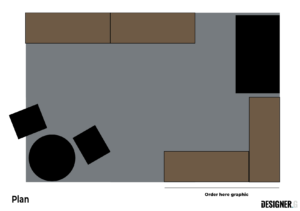
This was a simple graphic plan but done totally to scale and to fit the stand. This meant I needed the full sizes of all proposed furniture which was easily found and placed in.
We had in mind to buy furniture that was reflective of the brand style but also showcasing the products.
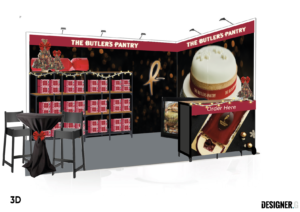 Next, I created a graphic visual of the stand. I did this in Illustrator, not using CAD software. This meant I used my knowledge of perspective drawing, using horizon lines and reduced lines. I decided to redraw the individual pieces of furniture in Illustrator to get a better finished presentable image for my client. I applied the proposed graphics, as per the Creative Briefing and this gave an overall feel for the finished product.
I created the large bokeh graphic in Photoshop and based it on the background from the cake so that this look would flow across all the graphic panels. The large Cake image is central to Christmas and took centre stage on the other panel so the visual flow was maintained across the stand. I also created their logo icon in a mock metallic finish which was die cut on foam board and attached to the graphic.
I also created a Christmas feel to the logotype with a softened blur mimicking back lighting or a soft focus. This was done using a warm cream on a red background to mimic their Christmas look featuring 2 reds and warm complimentary colours.
When designing an exhibition stand – its not the same as doing something for a shop which is permanent. It’s all about creating atmosphere using temporary materials and being clever about it.
I also created individual images of the furniture with graphics in place to show the client what they could expect. This helps them make decisions based on accurate visuals.
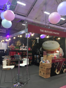
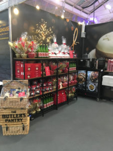
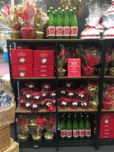
I have to say the design of this was an absolute dream. Not only is The Butler’s Pantry one of my favourite brands, I feel blessed to be working on such a remarkable brand, but also, as a client, they are incredibly clear about what they want. I have always said I can do my side of the project if I have the clear communication and nothing is better than a clear brief. I don’t mind if we have to change things to get the best image or font as long as the end result is a happy client. Here are a few images from the event:
 Previous Post
 Next Post