As I’ve been designing logos for many years, I have realised that the logos I design have personalities of their own. I know that my main goal in developing and designing logos for clients is to be the conduit for their vision for their business. Sometimes this means I have to deviate from my own personal taste and work to design the logo the client wants. Often my clients don’t know what they want and so I do try and guide them, this is rare. Designing logos for entrepreneurs means they already know what the want. With the world being so brand savvy now, most clients have a very clear picture and they need to get the vision for their logo realised. Communicating with clients has brought me to a place where I work extremely hard to provide some pretty awesome logos which I’m very proud of. Here are a selection of the logos I’ve loved doing.
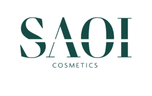
SAOI Cosmetics – Using negative space
I love this logo. The client knew she wanted to use the negative space as a design detail. So we worked hard on options to give that with a variety of fonts and colours. The finished logo uses a very classic serif font with the negative band across. This gives personality to the logo. It leans on the clean line to add drama and significance. After we agreed the logo, we searched for the correct colour. We had a range of greens and teals but landed on this fine, contemporary warm green. The combination of colour, tone, clean lines with the serif and negative centreline has produced a strong logo and brand. This brand is going to go places. Follow SAOI on Instagram and watch out for the best make up tips and brushes.
![]()
Priory Partners – Just keep it simple
This logo is a classic example of pulling back. Paring back to the minimal. What the client wanted was a logo that was black and white, simple, classic. After a look at logos in frames and with small icons, the client wanted to move away from any symbols that might be misinterpreted. So I looked to the location: Dublin. And of course the Spire was iconic. But I didn’t want it to be obvious . What I wanted was to use the Spire as inspiration for the design of the logo. I created a very strong dynamic shard to separate the 2 words which would mean the pronunciation of the name would be strong and with pause. The font had to be simple but with the target market. This means the font stays simple and yet serious. The client wanted to emphasise the trust and experience of their company and the combination of strong font, simple icon and monochrome colour conveys this effectively.

Turbo Promo – Illustrative icon
This logo was going to be different from the start. This was for a young musical entrepreneur who wanted to use his skills to promote music in an urban setting. He was very clear on the illustration he wanted and we matched it to a style for his premier music company. We picked a very straight grey tone to contrast with the simple, strong white font. The result was a really clear, industrial, contemporary look.
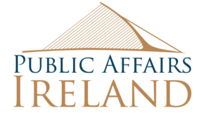
Public Affairs Ireland – A logo for the Public Sector.
The brief for this logo was to put Dublin central to their logo. They wanted their logo design to show their reach across both sides of the Liffey. The client wanted the logo to be classy, to be serious but to be Irish. The idea behind using the Samuel Beckett bridge image was to have it look like the strings on the Harp used for logos for Guinness. I drew the image from a photo and decided to use it with a gold finish. This logo needed to show it was new and fresh but to also give the feeling they are to be trusted. Hand on heart this is one of my favourite logos. Probably the one I’m most proud of. It really looks like how the client wanted it to. Learn more about PAI HERE.
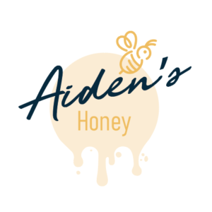
Aiden’s Honey – A personal project
We wanted a strong, but friendly look for Aiden’s Honey. This was a labour of love for a hobbyist. We were certain what we hoped was for this logo to be very strong online and on shelf. We picked warm yellow tones and pastels that worked in harmony to give the warmth from the logo. A warm dark navy then gave strength to the name of the logo and kept it modern.
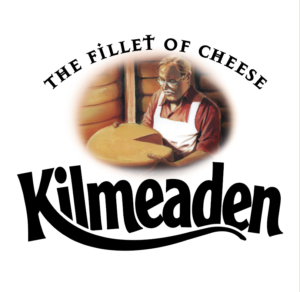
Kilmeaden – The “Famous” Logo
This logo is certainly the one I see more than others and I am certainly proud of it. I was pleased to be part of the original team working with Glanbia to produce a look to their new cheese which they launched in the early 2000’s. At that point in my career, I was working with a design agency in Dublin City Centre so the ability to work with a group of Creatives to produce this look was career defining. We commissioned an illustrator for the central image and worked to create a homely, separate logotype for The Fillet of Cheese and a bespoke logo for Kilmeaden. But without doubt, the best thing about this logo is that it is still used. It is still on packs. I still see it everyday (almost) and it hasn’t changed. Learn more about Kilmeaden HERE
![]()
SILVERDLUXE Logo – luxury and personality
This is a logo I designed for an online jewellery store. The client wanted to target the mostly female market with an eye catching icon. We wanted to keep this element colourful representative of the product. Contrasting to this we kept the type and colour of the company name monochrome and simple placing the emphasis on the jewel icon. Learn more about SILVERDLUXE HERE
![]()
Live Colourfully – A new fashion brand for activewear.
Live Colourfully is a logo I designed for a fashion house for the launch of their leisurewear. The requirement was for something minimal, yet not ignoring the basis of the company name. I decided to use a very sleek font and teamed it with 3 colour bands representing Air, Activity and Earth. The missing element in the E was removed to give a feeling of dynamism, a sense of movement and space.
 Previous Post
 Next Post