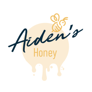
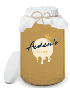
I was asked to design a logo for Aiden’s Honey. My main focus of the label was to be authentic and friendly but also something with a touch of artisan. I chose subtle colours of yellow tones and pastels so the back colour wouldn’t be too overbearing and emphasis was given to the name. I designed the main name with a favourite script of mine on the font really made this logo stand out. I love designing logos for packaging because you can really get a feeling for how the product will look on-shelf. Ultimately, it’s what Graphic Design is meant to do, make the product shine!
One thing I would say is when thinking about packaging design is to consider how the logo might work should the client decide to branch out into further lines for their product. I feel this logo is definitely something that would work just as well on other types of honey say, by changing slight colours and creating a brand.
But when a logo is a labour of love, there is always heart and someones passion that goes into it so I always try and translate the love, the personality and give it longevity.
 Previous Post
 Next Post