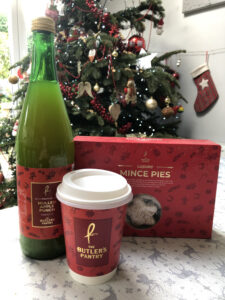
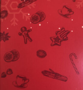
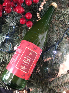
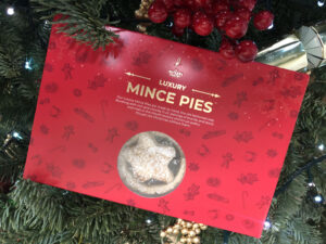
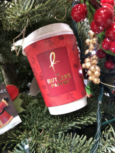
 There is nothing like Christmas. And simply nothing better than Christmas Packaging. I had the pleasure of working with The Butler’s Pantry on their Christmas look. As a graphic designer and lover of all things Christmas, this is the kind of project I dream about! The packaging required was for mince pies, coffee/tea cups, labels, tags, boxes but the look also extended into their retail communications. Overall we opted for a traditional old fashioned appeal using hand drawn graphic design illustrations. Each piece of packaging holds a mix of different illustrations of gingerbread men, cinnamon sticks, orange slices, tea cups, star anise, candy canes, walnuts, hazelnuts and cookies. We wanted to keep the artisan festive quality of the Butler’s Pantry brand by using 2 different reds and gold foil. This combination hints at the gourmet quality of the products. Red and gold work in perfect harmony together to make the products pop on-shelf. Altogether the packing works in harmony together and the finish with the gold is quality. The festive feel cannot be denied and the finish look was a massive success.
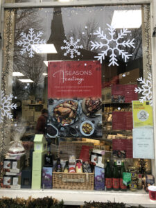
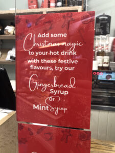
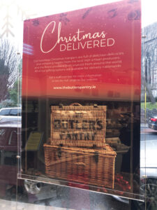
The look for the packaging extend into their in-window comms and in-store menus. The Butler’s Pantry Christmas experience really feels traditional, homely yet artisan. The entire store oozes quality with the food offering of the best quality centre stage. The posters and menus support this look and overall the full suite of designs hold together a wonderful Christmas appeal.
 Previous Post
 Next Post