Over the past few years, I have designed a few different sets of packaging for a few different beauty brands. I’ve worked on Neostrata, Exuviance, Benefit and Madison. What I have come to realise is that while brand is central to the product, packaging is the cheeky vehicle they ride on. The packaging of a beauty product is what speaks to the consumer while they are making their decision. We only have to look at the packaging trends behind Benefit, Charlotte Tilbury, even closer to home like SoSu.
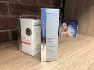 Neostrata Packaging Design
Neostrata produce a wonderful line of products for all skin ailments and conditions. In order to set their packaging design apart from others in the market, they have chosen a silver foil that wraps around the left hand side of the product box. This is an extra colour in the printing process but the design is simple and classic. It allows the product to appear clinical in finish, a requirement of the marketing and brand. Its such a simple addition but makes the product stand out from its competition and really gives a sense of superior product quality. Without it, it would just be another product on-shelf.
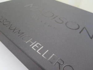 Madison Make-up Packaging Design
This packaging was for a set of make-up brushes for Madison Make-up. Instead of applying a wrap or sticker, we opted for a clear varnish finish on black boxes. These matt finish black boxes can be purchased online and the finish applied, keeping costs to a minimum but the finish is quite something. It is absolutely understated and minimalist and this is what the client wanted. The result was a strong product with understated appeal for the product launch. Honestly, they looked so cool.
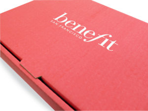 benefit Packaging Design
Its not often I get a bit starstruck by brands I work on but this certainly was one. I am such a huge fan of this brand. The make up is fine too I guess (lol) but its the personality of benefit that appeals to me. The look, the marketing, it’s all pretty much amazing. Anyway, I included this here as obviously their product packaging is done in the USA but this was a box was that required for press release. It was to house their products and marketing material for media and beauty experts. We opted for a deliberately harder finish box. This is corrugated cardboard! An almost “basic” board, it is everything you don’t expect from benefit. But this works. Once their brand was applied with their benefit pink colour and white logo, it softened the tone and looked brilliant. To top it all off, it was sturdy and hardwearing.
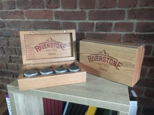 Riverstone Tobacco Packaging Design
Riverstone is a new tobacco launched by John Player. This was a box pack that required inner sections for flavours of tobacco, papers and filters. There is even a small hidden drawer at the side of this box with a removable drawer for extra items. This box is not wooden. It was made with Folding Box Board, finished with a gloss and magnets to have it snap closed. This was a massive feat of packaging design, engineering and finish! Its a hard wearing box that was a brilliant answer to a wooden finish without having to pay for the privilege of using wood. It looks like a glossed wood and it lighter than wood. It was a really interesting packaging design project to work on.
 Previous Post
 Next Post